Having a great social media presence is important for brands, especially in our digital-first landscape. Unlike in the past, when brands competed for their audience's attention through radio commercials or magazine ads, brands now use social media to promote their products and engage their audience.
This is why having creative and engaging social media graphics is key. However, not every marketer or business owner is a graphic design whiz. So just how do you create a post that can catch your audience’s eye?
We prepared some tips for you below to help guide you on creating stronger visual content and have a more effective marketing strategy. Let’s dive in, shall we?
|
CONTENTS 1. Tips for Engaging Social Media Graphics 1.2. Don’t forget your branding |
1. Tips for Engaging Social Media Graphics
While each social media platform has its own unique characteristics, the general guidelines for creating an engaging social media graphic remain similar. Here are some examples:
1.1. Stick to an aesthetic
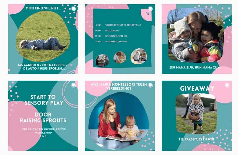
In social media, aesthetic is the overall style or look of a certain brand. It’s the distinct theme or mood that brands portray in their social media feeds or content. This aesthetic can be built by using the same color palette, layout, typography, photography style, or graphic style in your social media content - therefore associating that particular aesthetic with your brand.
You can use an aesthetic that fits your brand, your brand identity, and of course, your target audience. These could either be dark and edgy, classic and glamorous, colorful and bright, retro and Y2K, or minimalist and simple.
Some examples: Recess with its bright pastel color palette, Headspace with its cute graphic illustrations, Madewell with its casual and candid fashion shots, or Heliot Emil with their black and white theme.
Aside from being visually appealing, sticking to a specific aesthetic helps build recognition for your brand. When your audience sees your post in their feed, they can immediately recognize that it's you, even if the post itself is not promotional. It helps create an identity that your audience can easily associate with your brand.

1.2. Don’t forget your branding
Speaking of your brand identity, it’s also crucial to make sure your branding is always visible on your social media content. This means using your signature color palette and typography throughout your post. If you’re adding text or captions, make sure it aligns with your brand voice. Your logo design should also be visible at all times so that if a new audience sees your post, they will know which brand you are.
Speaking of logos, you should also create different variations of them. Aside from the primary logo design that you will mainly use, you should preferably have different versions of it, such as a text-only logo, an icon-only logo, or a vertical or horizontal stacked one. This way, you can use a logo that will fit the size or context of your social media post.
If you don’t have a logo yet, you can make use of logo maker tools online or look for an agency that can help you out with the design.
Sticking to your set branding style is important as it will create a consistent look for your social media graphics. Just like with your aesthetic, it will help your audience in recognizing and remembering your brand.
A good example of a brand following this tip is KFC. They make sure to add a touch of red and white on their posts, whether they are posting an image or video. Another is Tiffany & Co., where their iconic baby blue color is always visible on their posts.
1.3. Utilize videos
It’s no secret that videos are becoming the new staple for social media. With the rise of TikTok and their viral short-form videos, other platforms like Instagram and YouTube are also now focusing on videos, with Reels and YouTube Shorts.
Videos are proving to provide better return of investment or ROI for brands. This is because 66% of users find short-form videos more engaging compared to other content formats on the internet. 8 out of 10 users also say that they brought something from a brand after watching a video of it.
If you want to know how to get the most out of your videos with your email marketing campaign visit Viewed. The only platform to play videos within email.
Videos are definitely vital for your social media success. But how do you create engaging videos for your users? First, do comprehensive research on your audience. What kind of content do they like to see? Do they prefer a more informative video or a funny one?
From there, you can plan the flow of your video content. The next thing is to make sure your video is properly shot, with great lighting and clear audio quality. No one wants to watch a shaky video with dim lighting, right? You can also use suitable background music and add effects/transitions to enhance your videos.
One thing to take note is that a lot of people watch videos with the sound off. So make sure you add subtitles or text to your video, and that your video is shot in a way that can still be understood even without sounds. Additionally, integrating generated dynamic QR codes into your videos can provide an interactive element for viewers to access additional information or others.
All of these tips will apply to all video types, whether you are creating an influencer video, Facebook ads, a product launch, a Q&A video, and many more.
1.4. Use premium stock photos
We all want to shoot and produce high-quality photos and videos at all times. However, unless you're a huge name brand, it's pretty much impossible to have these on hand all the time. This is why most businesses rely on stock photos.
While stock photos get a bad reputation, they are still a huge help when it comes to creating social media graphics. After all, marketers use a huge amount of images, and stock photos are great when you need a professionally shot image fast.
To avoid the cliche “businessman smiling at the camera” or “woman eating salad” photos that we all have seen a thousand times, use paid sites. As these are paid, there are fewer people using these photos compared to the ones in the free and easily accessible sites.
Also, look for photos that are more candid and casual instead of the posed ones. This will make your photos look more natural and less “staged”. You can also use a tool like TinEye, so that you can see how many times the stock photo has been used.
1.5. Understand visual hierarchy
Visual hierarchy is the order in which humans process or understand information that they see. Designers use different visual elements to influence someone’s perception and guide their next action, or emphasize specific parts of a design.
The different elements in visual hierarchy are: size, color, contrast, alignment, repetition, proximity, whitespace, and texture.
For example, bigger sized text is more noticeable, so use that for your important texts. Bright colors attract more attention, so use bold colors like red or yellow for your CTA. Just the same, adding whitespace behind your CTA will also draw more attention to it. Dramatically contrasting colors also draw your audience’s eye, so use that as a background design when promoting a new product. If you have text in your graphic, align them from top to bottom as this is how people usually read texts.
Adhering to visual hierarchy will make your social media graphics look more coherent and easy to understand. It will also make it easier for you to communicate your message effectively. Aside from that, your graphics will also look more visually engaging.
1.6 Be creative with layouts
Make your graphics more visually outstanding by playing around with the layout. While this tip is more suited to Instagram, with its three-grid layout, it’s still applicable to other social media platforms as well.
A great example of a brand doing a creative spin to their posts is clothing brand Ebby and I, where they always post three photos of their model wearing one specific clothing. This gives their feed a very cohesive look.
There are many layouts that you can recreate for your feed. One example is the checkerboard layout, where you alternate between one style of post and another. Some utilize this by alternating between an image post then a text-only post, or alternating between specific colors for the backgrounds. Some alternate their post with just a plain black or plain white post, to form some sort of a division for their feed.
If you have an upcoming campaign or you have a new account, you can also try posting in “Puzzle style”, where you post split photos that when grouped together show a whole picture. You can also do an easier version of this, where you only aim to group them either horizontally or vertically.
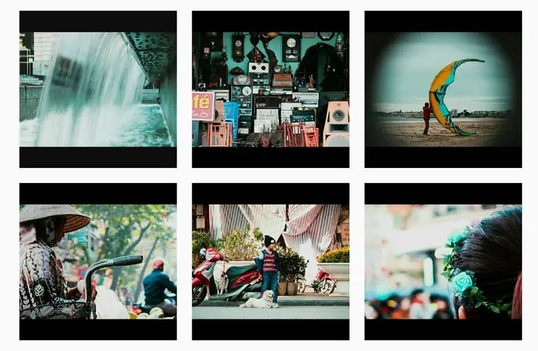
An easy way of playing around with layout is by putting a border on all your images or video posts. You can use either white or black for a minimalist look, or play around with different colors to have a more vibrant feed. Additionally, adjusting background colors can further elevate the visual appeal of your content, allowing you to create captivating combinations and personalized theme.

2. Wrapping Up
With the abundance of brands pushing out content day in and day out, it’s easy for your brand to get lost in the mix. That’s why creating engaging social media graphics is important if you want your audience to take notice of you.
If you don’t want them to scroll past you, make sure your posts are creative and visually appealing. Design your post with visual hierarchy in mind, stick to a certain aesthetic, and play around with layouts or current trends to keep your post as engaging as possible. Of course, make sure you are also following the correct size aspect of your chosen social media platform, and use clear and attention grabbing captions. All of these tips should help you make the most of your social media strategy.


